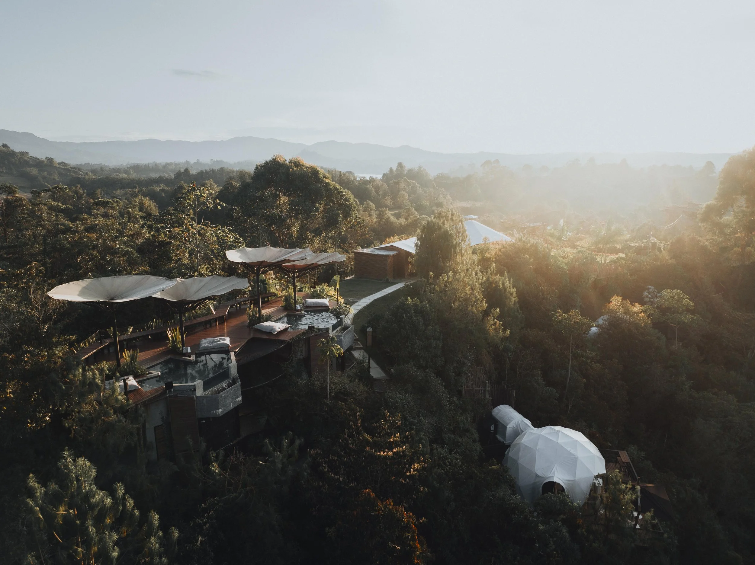

Colour shapes how we experience a destination long before we fully register its architecture or geography. From the cobalt blues of the Greek seaside and the volcanic blacks of Iceland to rainforest greens and desert reds, every landscape carries a palette that influences mood, perception, and emotional response. Studies in colour psychology suggest that blues and greens promote calm and restoration, earth tones create grounding and warmth, while brighter shades stimulate energy and connection. Through design driven hotels and nature led stays, travel becomes an immersion into these natural palettes, where architecture, climate, and landscape work together to shape atmosphere, memory, and our deeper connection to place.