
The Natural Colour Study: How Place Shapes Feeling
Colour is one of the first ways we experience a landscape, often before we fully register its shapes or textures. The deep cobalt of the sea, the pale dust of limestone cliffs, the burnt reds of desert earth, the dense greens of rainforest canopies. Every environment carries its own palette, shaped by geology, climate, vegetation, and light. In nature, colour is never decorative. It is atmospheric, emotional, and deeply tied to how a place is felt in the body. Certain destinations remain with us less through specific memories and more through tones and hues: the white and blue of the Cyclades, the black volcanic rock of Iceland, the ochre warmth of Morocco at sunset. Colour becomes a language of place.
Our relationship to colour is also physiological. Studies in colour psychology suggest that different tones subtly influence mood, perception, and nervous system response. Blues and greens are often associated with calm and restoration because they mirror water, forests, and open sky, environments humans have evolved alongside for thousands of years. Earth tones create feelings of grounding and warmth, while brighter shades like yellow and orange stimulate energy, optimism, and social connection. Even the soft desaturation of fog, stone, and winter light can slow perception and encourage introspection. In this way, landscapes shape our emotional state through colour itself.
Travel deepens this relationship because it places us inside entirely different palettes. Moving through a destination becomes an immersion into another visual rhythm, where architecture, food, textiles, weather, and nature exist in conversation with one another. A Greek island feels inseparable from sun-bleached stone and ultramarine sea. Tropical regions carry lush greens and saturated floral colours that heighten the senses. Nordic landscapes lean toward softer silvers, moss, pine, and muted light that invite quiet and reflection. Through design-driven hotels and nature-led stays, these colours become even more intentional, framing how we rest, observe, and connect to place. We not only experience geography, but also step into the emotional atmosphere created by colour itself.
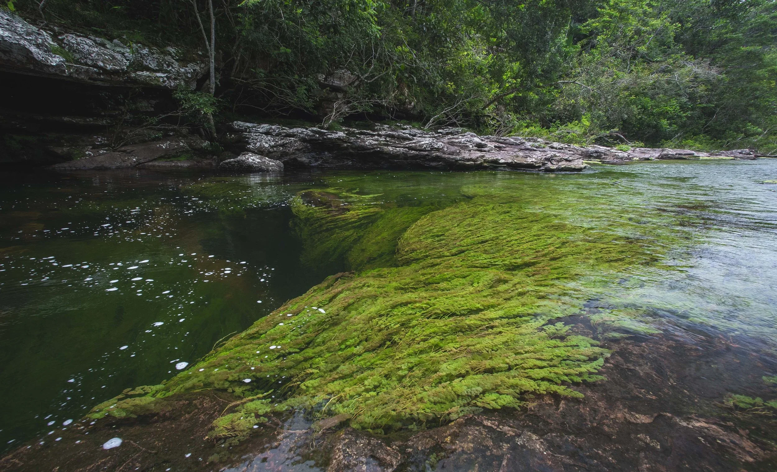
Photo by La Manigua Lodge
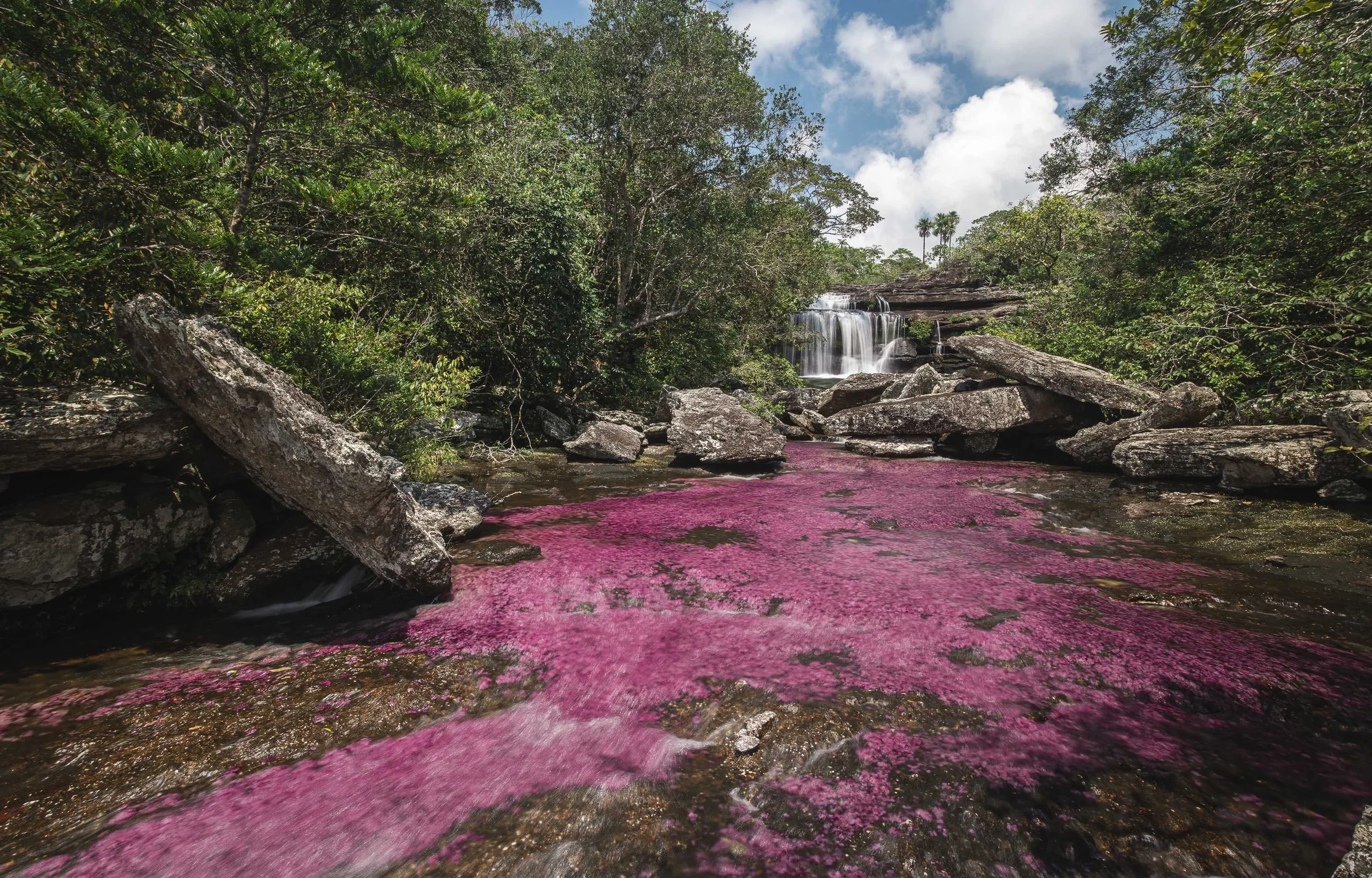
Photo by La Manigua Lodge
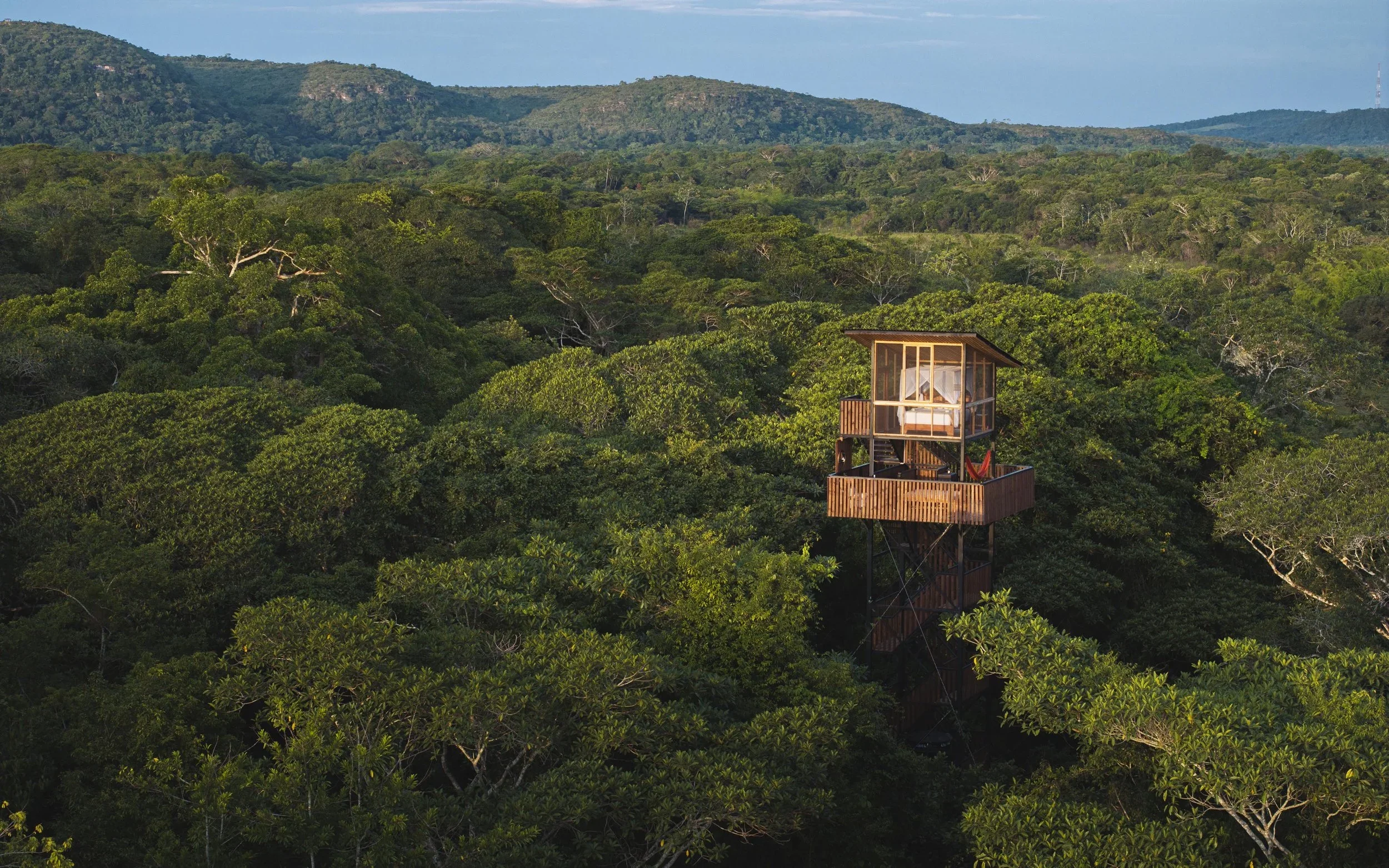
Photo by La Manigua Lodge
La Manigua Lodge
Hidden within the remote landscapes surrounding Caño Cristales in Colombia, La Manigua Lodge is shaped by saturated jungle greens, rich earth browns, river blues, and the extraordinary natural pinks that emerge within Caño Cristales itself, often called the “River of Five Colours.” During certain seasons, aquatic plants beneath the clear water transform the river into vivid shades of pink and magenta, creating one of the most surreal natural colour palettes on Earth. The surrounding rainforest feels dense and alive, where humidity, filtered light, stone, and vegetation constantly shift the visual atmosphere. Architecture uses natural materials and open air design to remain deeply connected to the environment, allowing colour to emerge directly from river, forest, soil, and sky rather than decoration.
Psychologically, green is associated with restoration, balance, and nervous system regulation, while earth browns create grounding and emotional warmth through their connection to soil and shelter. The rare pink tones of Caño Cristales introduce a completely different emotional layer, often linked to softness, emotional openness, wonder, and sensory stimulation. Together, the palette at La Manigua Lodge feels immersive, restorative, and almost dreamlike, reinforcing a powerful sense of connection to one of the world’s most visually unique ecosystems.
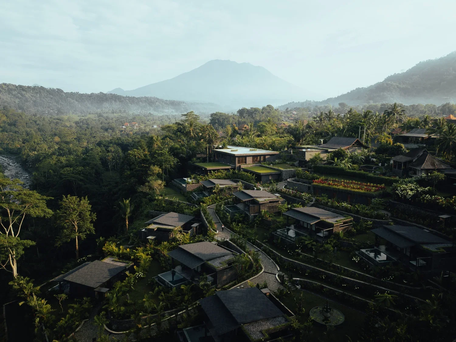
Photo by Samanvaya
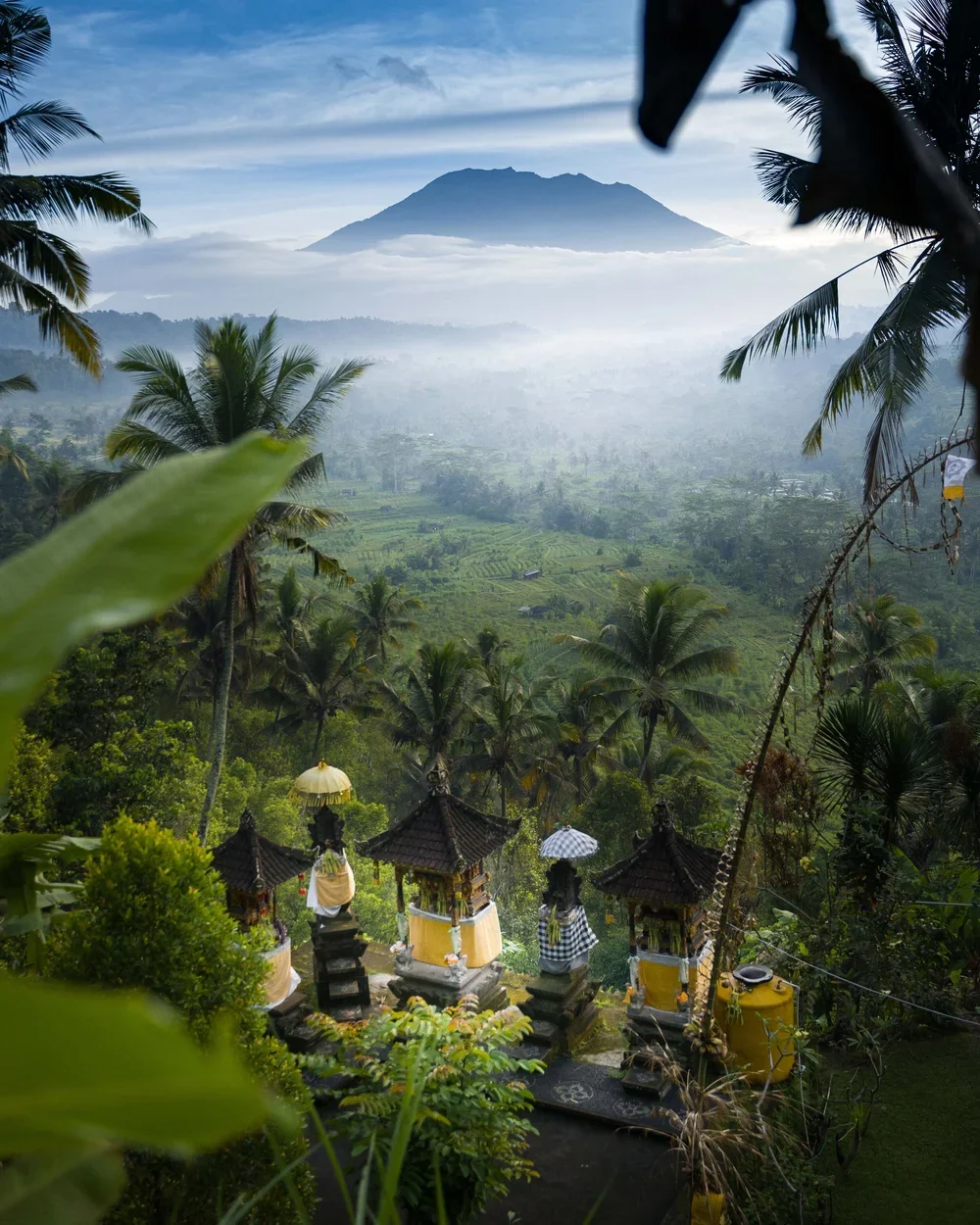
Photo by Samanvaya
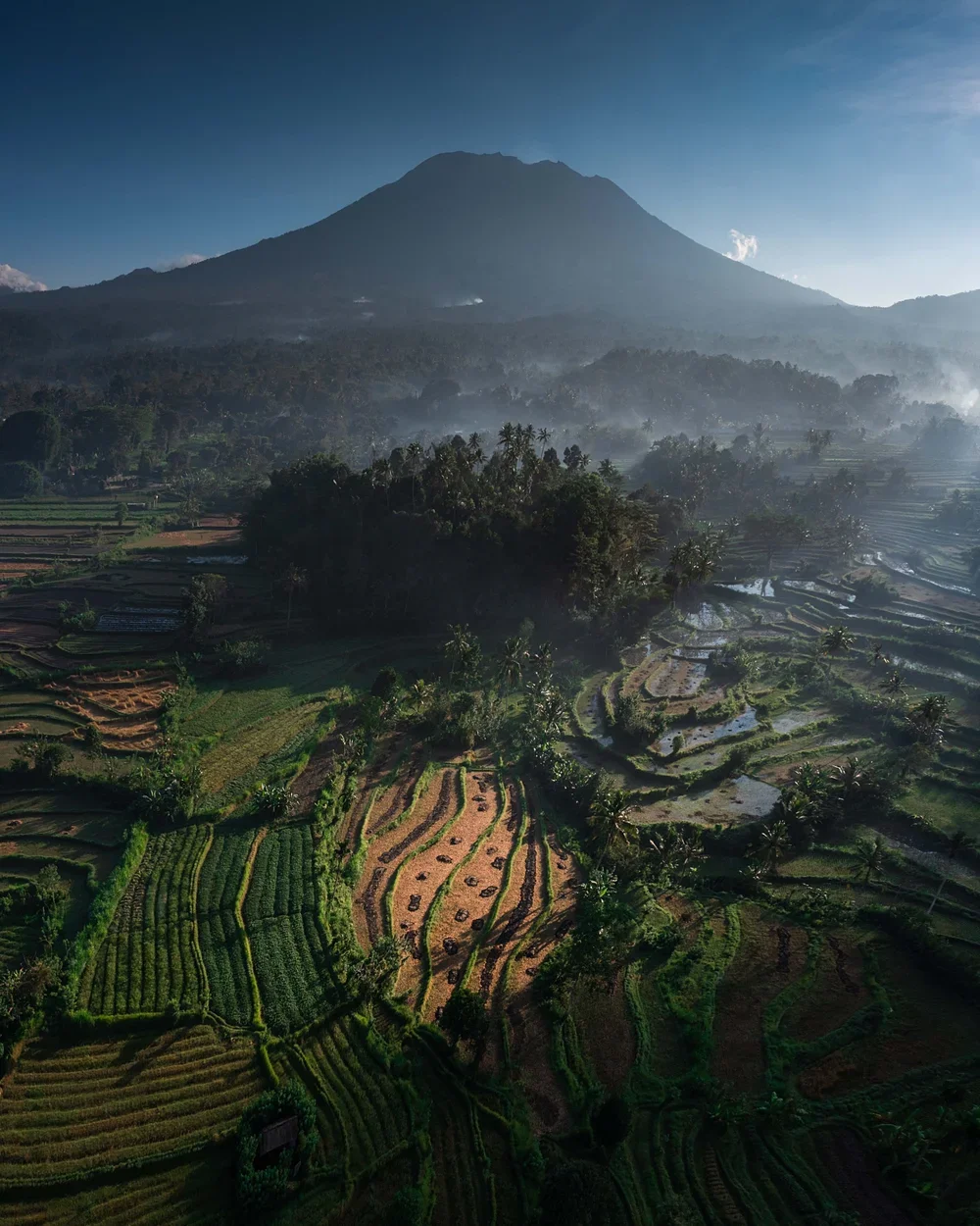
Photo by Samanvaya
Samanvaya
Surrounded by rice terraces, palm forests, and tropical vegetation in eastern Bali, Samanvaya is defined by layers of palm green, bamboo brown, volcanic earth, and warm filtered light. The architecture relies heavily on natural bamboo structures and open pavilions that allow the surrounding landscape to shape the atmosphere entirely. Greens dominate the experience, softened by natural timber textures and the shifting golden tones of tropical sunrise and sunset.
Palm greens psychologically encourage calmness, restoration, and emotional renewal, while bamboo browns and earth tones create feelings of grounding and safety. Together, the palette slows visual overstimulation and supports the slower rhythm associated with tropical landscapes. The result feels deeply connected to balance, softness, and sensory ease.
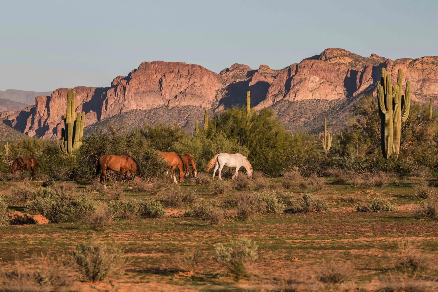
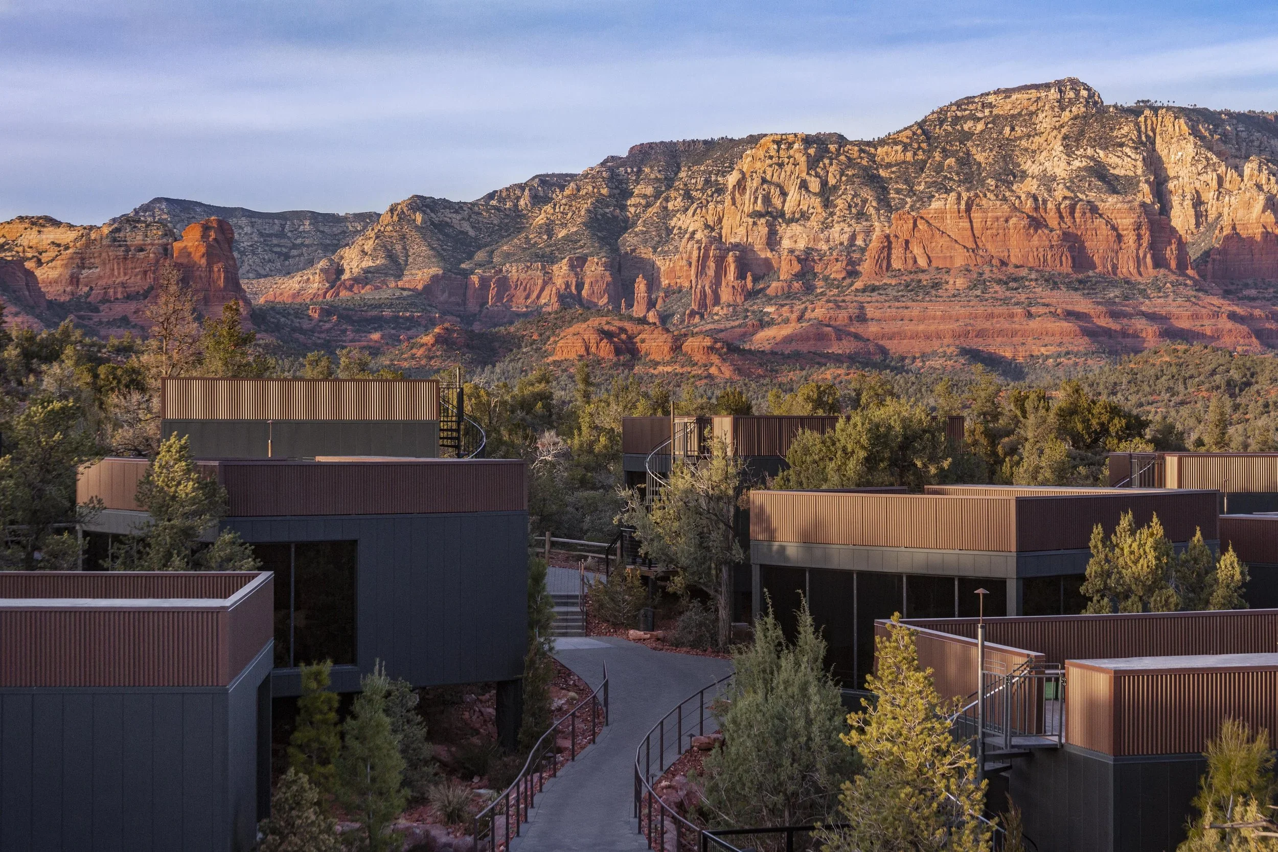
Photo by Ambiente
Ambiente Sedona
In the desert landscapes of Sedona, Ambiente is immersed in a palette of burnt sandstone red, rust, copper, and soft desert neutrals shaped by the surrounding canyon terrain. The architecture mirrors the geology directly through reflective glass, dark metal, and restrained materials that allow the dramatic red rock formations to remain visually dominant. Light changes constantly across the landscape, intensifying the reds and oranges at sunrise and sunset until the entire desert seems to glow.
Warm desert colours are psychologically energising while still creating grounding through their connection to earth and stone. Reds and burnt oranges stimulate vitality, creativity, and emotional warmth, while softer sand tones balance the nervous system with calmness and stability. In Sedona, colour creates an atmosphere that feels both expansive and deeply visceral.
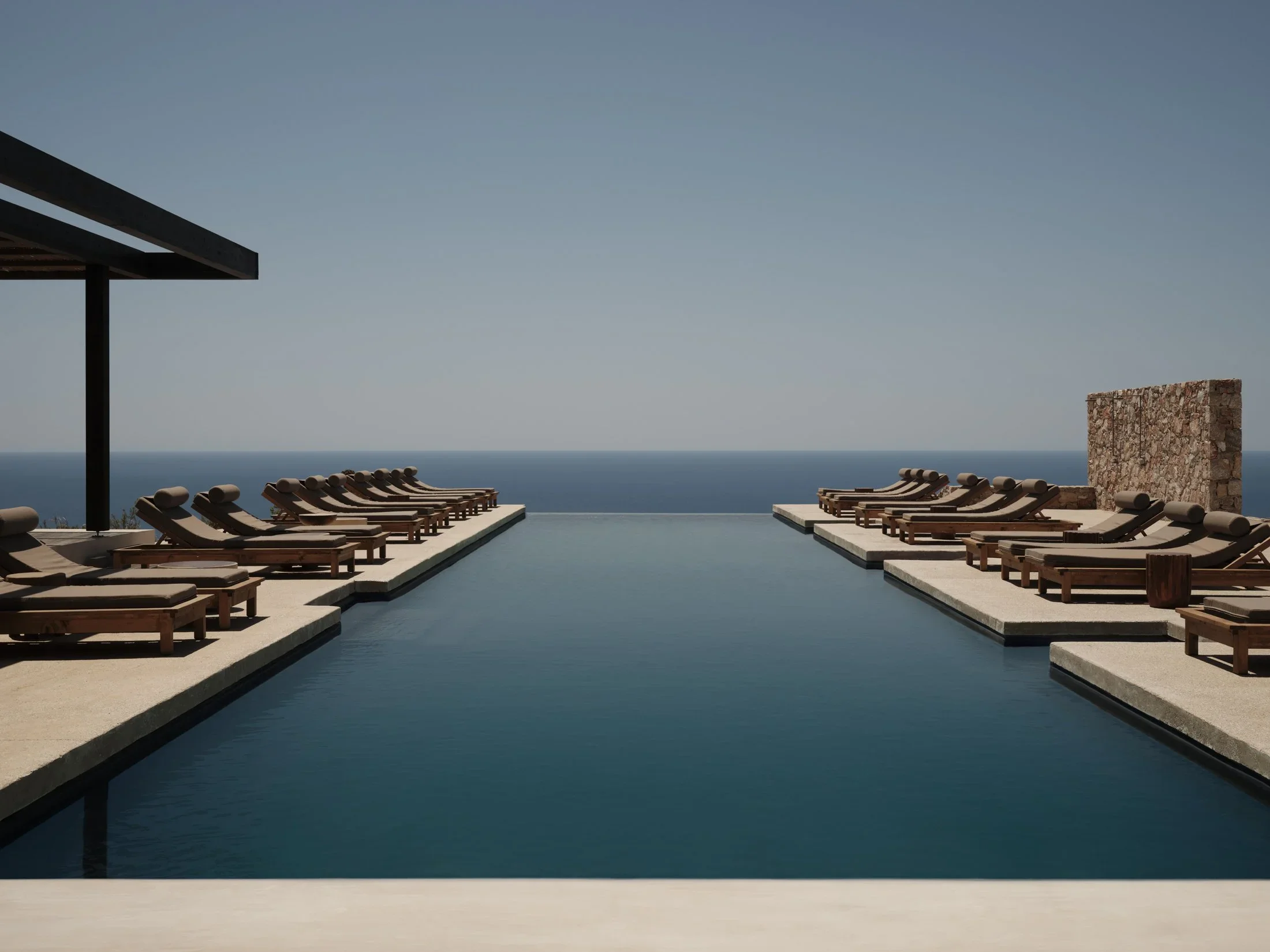
Photo by Gundari
Gundari
On the cliffs of Folegandros in the Cyclades, Gundari is shaped almost entirely by Mediterranean blue, pale limestone, and sun bleached stone. The surrounding geography feels raw and elemental, where deep cobalt sea meets dry rugged terrain beneath intense Greek light. Architecture responds through minimal forms, natural stone, and restrained interiors designed to dissolve into the surrounding coastline rather than compete with it.
Blues are consistently associated with emotional calm, spaciousness, and lowered stress response because they mirror open sky and water. Combined with pale mineral tones and bright natural light, the palette at Gundari creates psychological clarity and stillness. The landscape feels cleansing and expansive, encouraging slower thought and sensory quietness.
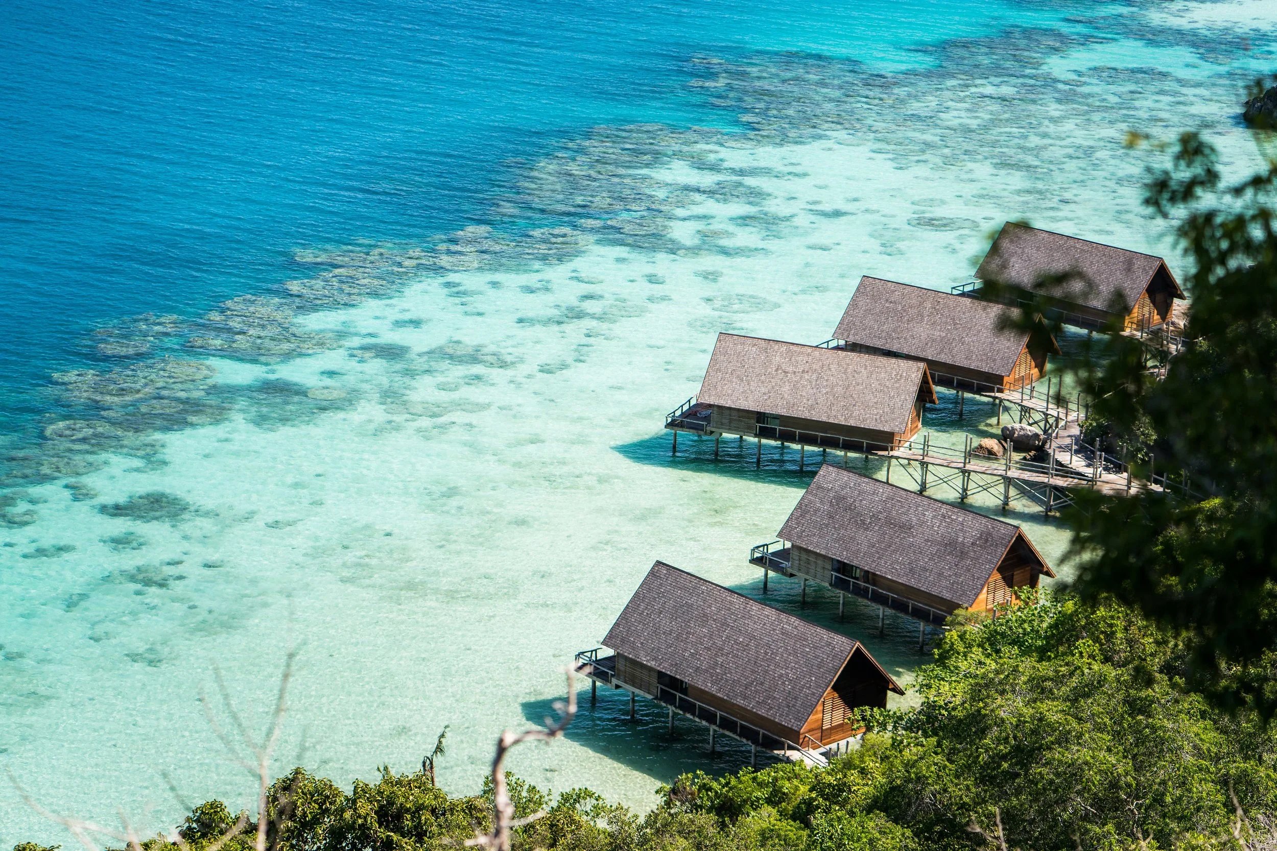
Photo by Bawah Reserve
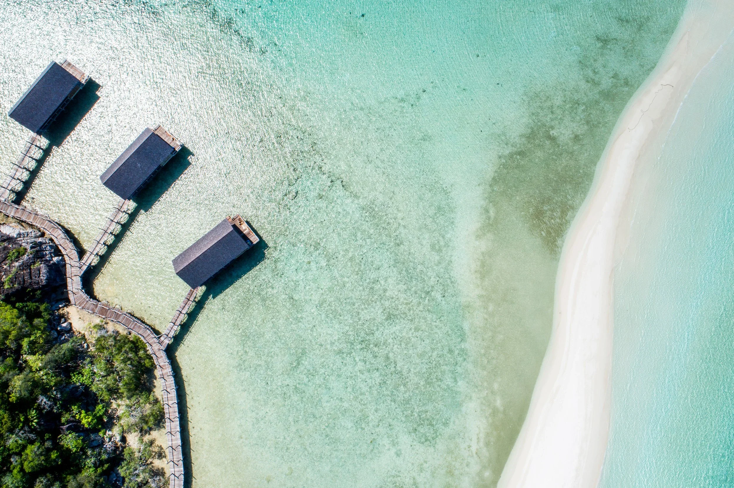
Photo by Bawah Reserve
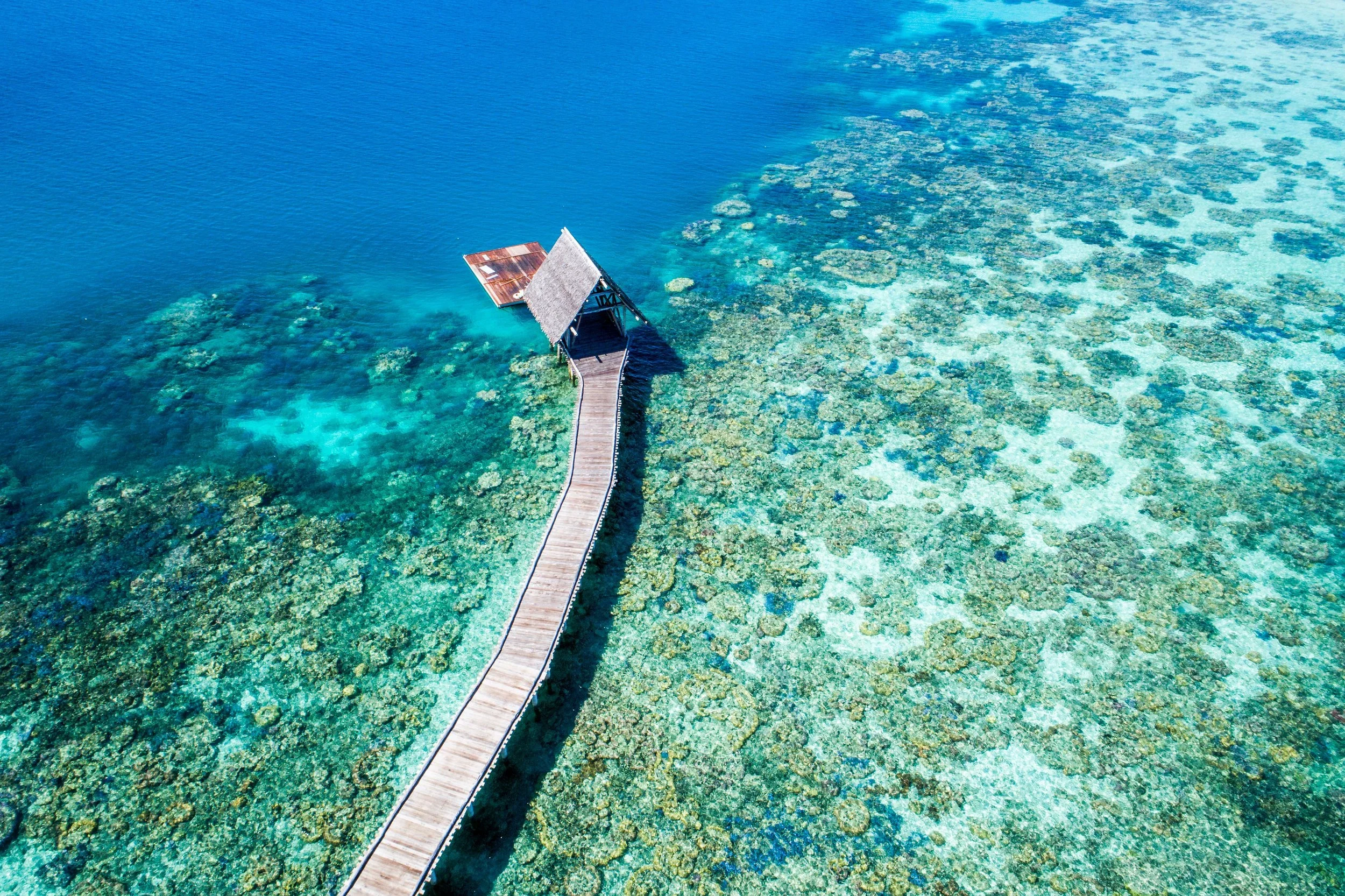
Photo by Bawah Reserve
Bawah Reserve
Spread across remote islands in Indonesia’s Anambas Archipelago, Bawah Reserve is immersed in lagoon turquoise, coral white, deep ocean blue, and lush tropical green. The sea dominates the visual experience completely, shifting constantly between translucent aquas and darker marine tones depending on light and depth. Architecture remains intentionally light and open, using natural timber and woven textures that allow the surrounding colour palette to remain uninterrupted.
Turquoise and blue tones are psychologically linked to emotional release, calmness, and openness because of their association with water and horizon. Tropical greens add restoration and sensory vitality, while bright white sand reflects light in ways that create feelings of spaciousness and clarity. Together, the palette creates a strong sensation of freedom and escape from mental noise.
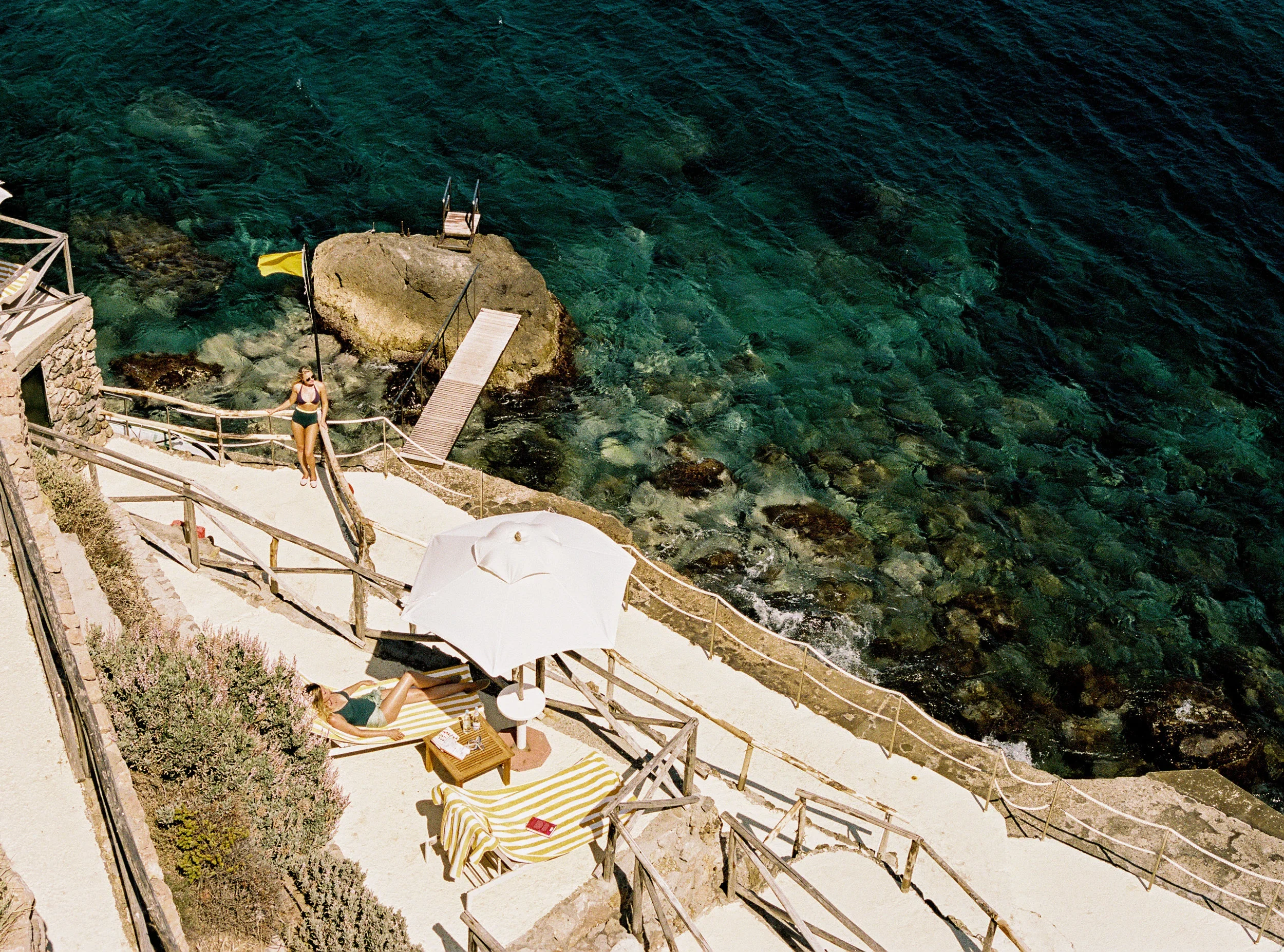
Photo by Il Pellicano
Il Pellicano
Along the Tuscan coastline, Il Pellicano is defined by sea moss green, olive green, terracotta, and faded Mediterranean blues softened by decades of salt air and sunlight. The landscape moves between rocky coastline, pine trees, wild gardens, and calm sea, while interiors reflect an understated palette rooted in Italian coastal life rather than trend driven luxury.
Greens psychologically encourage calmness, familiarity, and restoration, particularly when softened through natural textures and weathered tones. Olive and moss shades create warmth without overstimulation, while muted blues reinforce emotional ease and relaxation. The atmosphere feels nostalgic, sensual, and deeply tied to slow Mediterranean living.
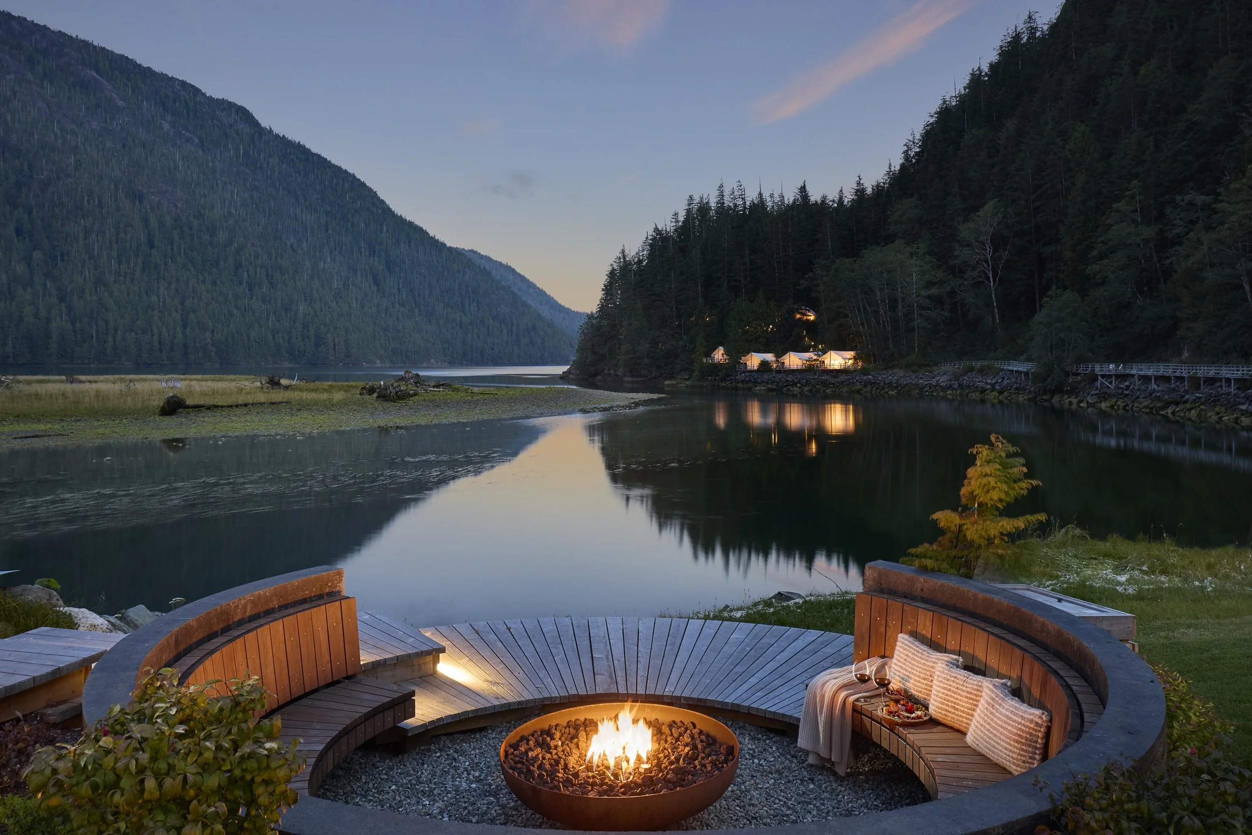
Photo by George Apostolidis
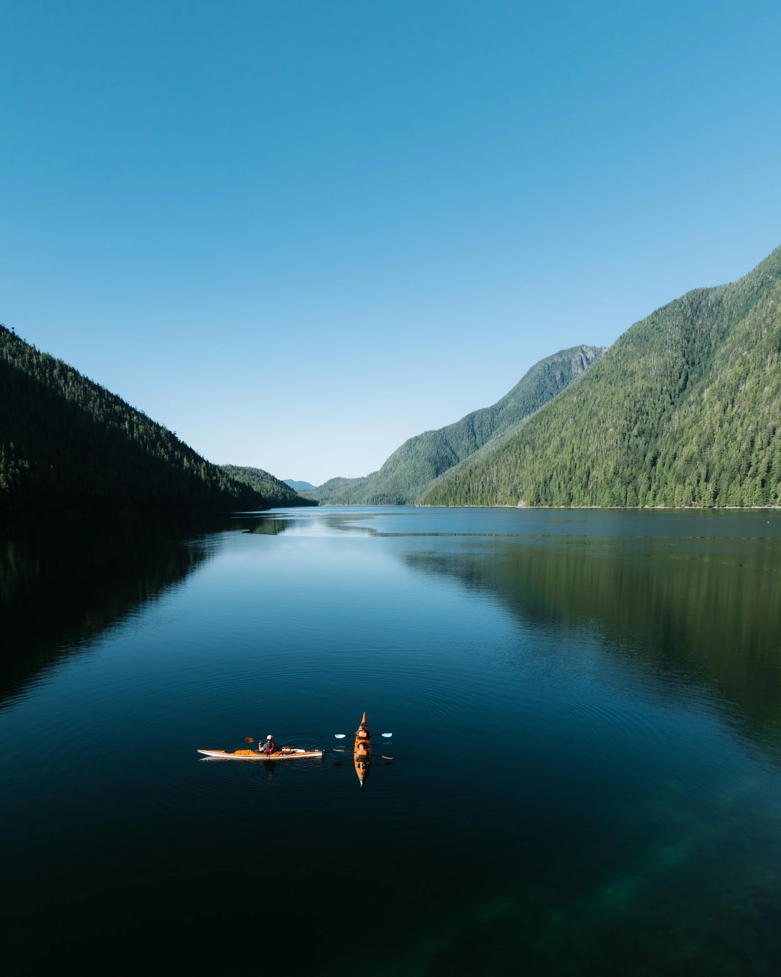
Photo by George Apostolidis
Clayoquot Wilderness Lodge
Within the ancient temperate rainforests of Vancouver Island, Clayoquot Wilderness Lodge is immersed in rainforest green, cedar brown, river stone grey, and misty coastal blue. Dense forest canopy, moss covered trees, and constantly shifting fog create a palette that feels deeply primal and immersive. Architecture uses canvas, timber, and natural materials that remain intentionally secondary to the surrounding wilderness.
Rainforest greens are strongly associated with restoration and lowered stress because they reflect biologically familiar environments tied to safety and abundance. Cedar browns add warmth and grounding, while misty blues and greys encourage introspection and stillness. The result is a palette that slows perception and reconnects attention to natural rhythm.
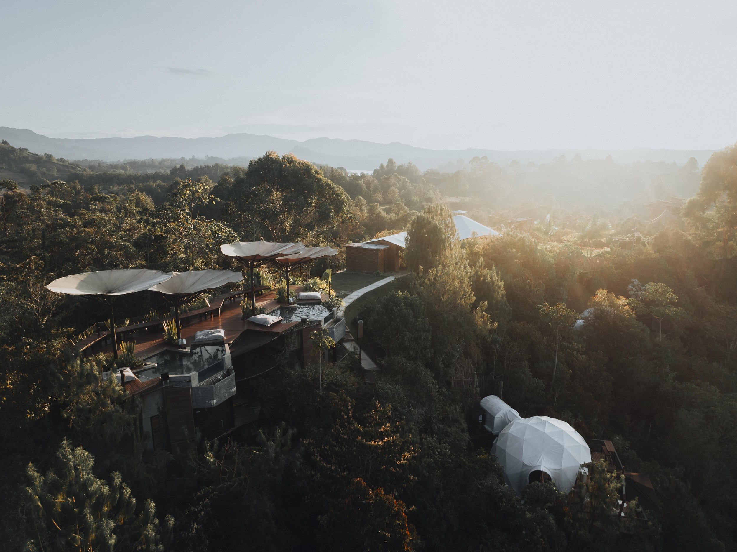
Photo by Bosco
Bosco
Hidden within Colombia’s dense tropical landscapes, Bosco is shaped by rich earth browns, saturated jungle green, volcanic black stone, and filtered rainforest light. Architecture feels deeply integrated into the surrounding terrain, using organic materials, textured surfaces, and shadow to create spaces that feel almost absorbed by the forest itself.
Earth browns psychologically create grounding and emotional stability because they mirror soil, wood, and natural shelter. Combined with dense greens, the palette encourages restoration, focus, and reconnection to physical environment. The darker tones also create intimacy and sensory depth, making the experience feel immersive and protective.
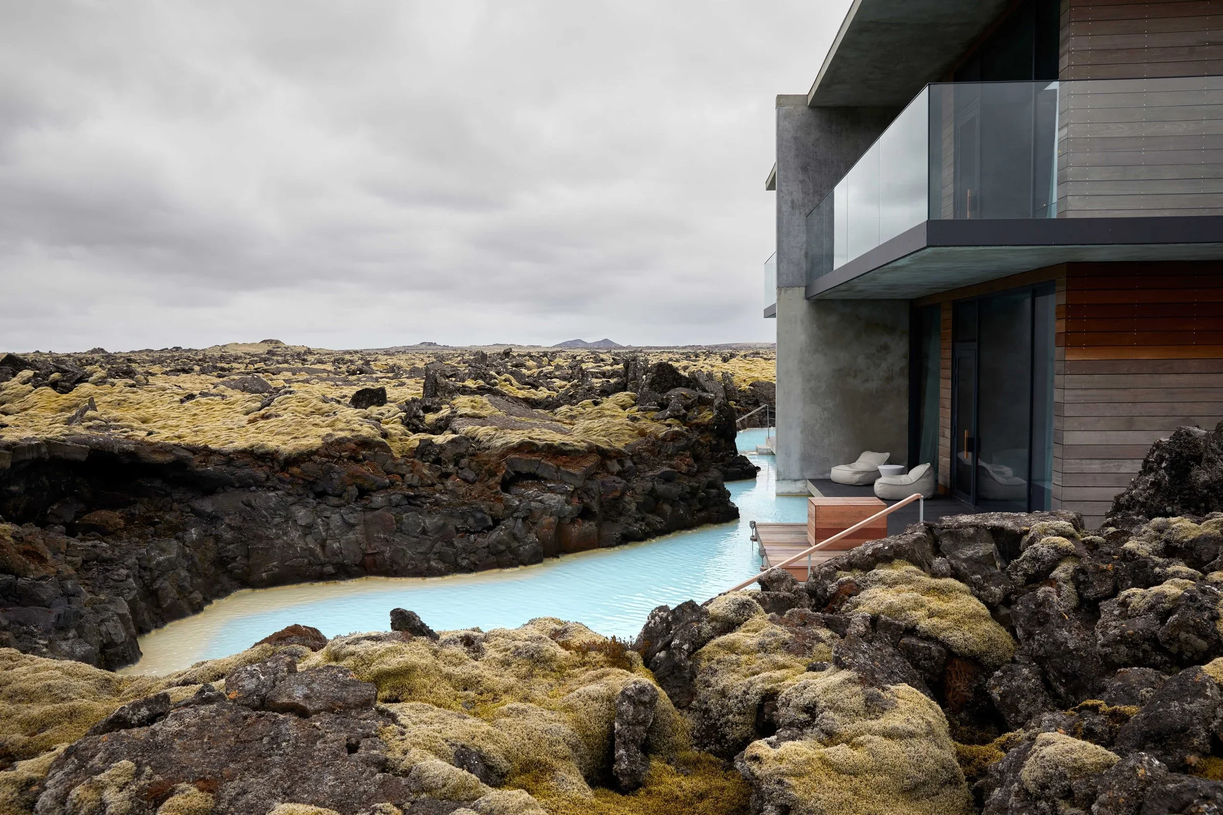
Photo by The Retreat at Blue Lagoon
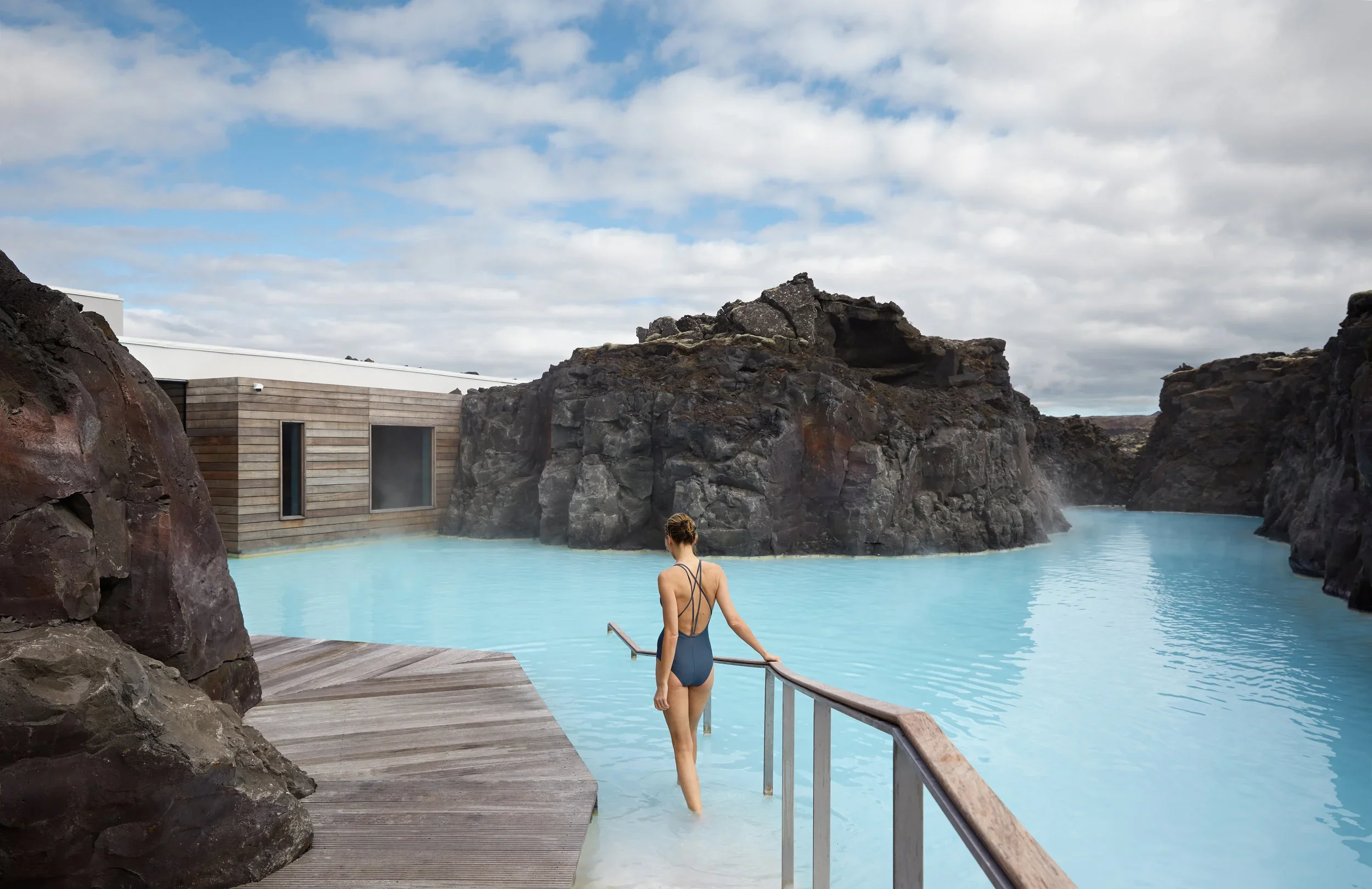
Photo by The Retreat at Blue Lagoon
The Retreat at Blue Lagoon Iceland
Set within Iceland’s volcanic landscape on the Reykjanes Peninsula, The Retreat at Blue Lagoon Iceland is defined by lava charcoal black, mineral white, sea moss green, and the luminous milky blue of its geothermal waters. The surrounding terrain feels raw and almost otherworldly, shaped by ancient lava flows, geothermal steam, shifting fog, and stark Nordic light that changes dramatically with the seasons. Architecture responds through minimalist forms, dark volcanic materials, and interiors carved directly into the lava field, allowing the lagoon and surrounding geology to remain central to the experience.
Psychologically, black volcanic landscapes evoke awe, stillness, and heightened awareness of scale, while pale mineral tones soften the environment with feelings of purity and calm. The soft blue waters create an immediate sense of relaxation and nervous system release through their connection to warmth, water, and openness. Combined with muted greens drawn from moss covered lava fields, the palette feels deeply meditative, elemental, and restorative, creating an atmosphere that slows perception and reconnects the body to the rhythms of nature.
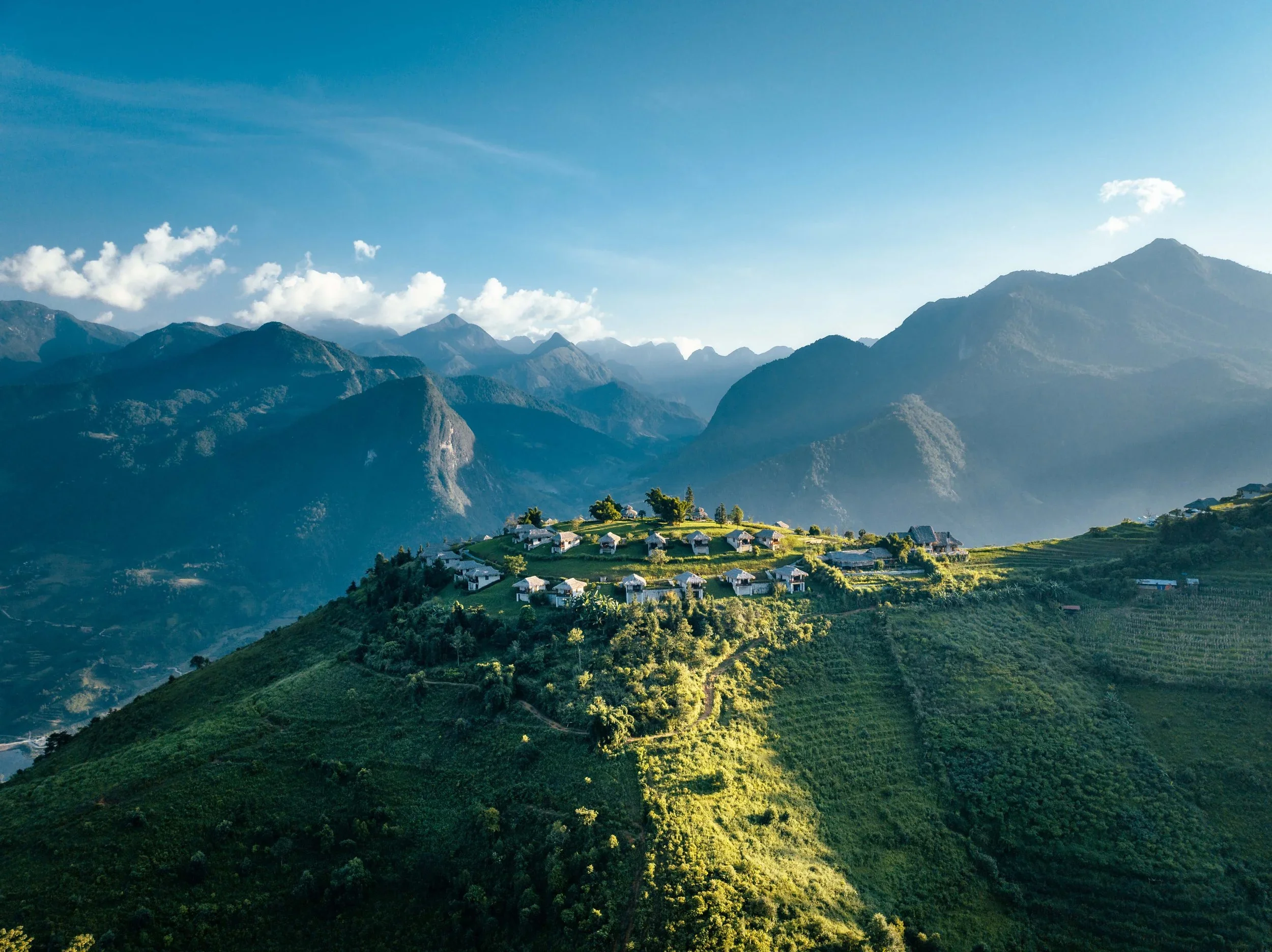
Photo by Topas Ecolodge
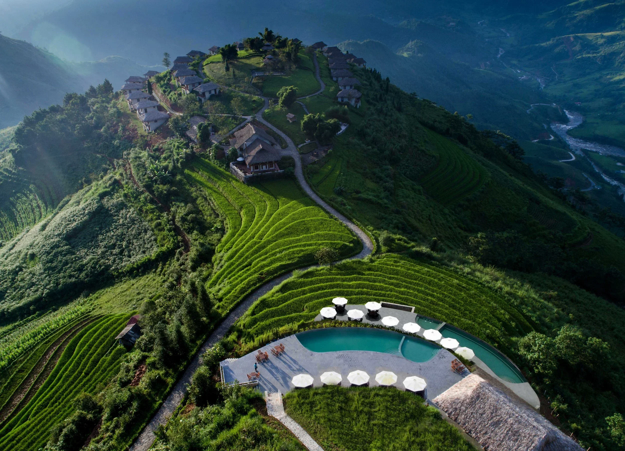
Photo by Topas Ecolodge
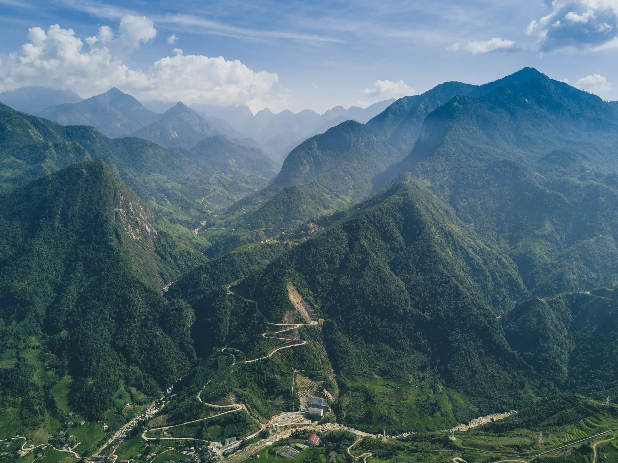
Photo by Topas Ecolodge
Topas Ecolodge
High in the mountains of northern Vietnam, Topas Ecolodge overlooks layered rice terraces, mist filled valleys, and vast open skies shaped by shifting weather and altitude. The landscape is dominated by rice paddy green, soft sky blue, earth brown, and silver mountain fog that changes constantly throughout the day. Simple granite bungalows and natural materials allow the surrounding colour palette to remain uninterrupted.
Greens and blues together are among the most psychologically restorative colour combinations because they mirror environments tied to water, vegetation, and open air. The softer desaturated mountain tones also encourage introspection and mental quietness, while earth browns maintain warmth and grounding. The overall atmosphere feels spacious, calming, and deeply connected to rhythm and seasonality.
Room + Wild is the world's first and leading collective and platform for landscape-enhanced accommodation, ecotourism, nature-based destinations, and sustainable luxury travel experiences. We consistently inspire, influence, and spread awareness through our tailored travel guides, curated media content/channels, brand activations, press trips as well as visual and narrative storytelling.
Coined by marine biologist Dr. Wallace J. Nichols, the "Blue Mind" hypothesis explains why being near, in, or on water triggers a deeply meditative state that reduces stress and anxiety. By activating the parasympathetic nervous system, the gentle movement and sound of oceans, lakes, and rivers naturally lower heart rate, reduce cortisol, and restore cognitive energy through "soft fascination." More than just scenic beauty, water serves as a biological cue for deep relaxation—making waterfront retreats and nature-immersed hotels the ultimate sanctuaries for wellness, clarity, and mental restoration.